Tomorrow (Saturday 27th of June) is the start of the 53rd edition of the Western States Endurance Run (WSER, or Western States for short), a legendary long-distance race taking place in the Sierra Nevada mountains of California.
I like marine microbes, but I also really like running, and I’m quite excited for this year’s edition of the Western States. Dawdling on the official website of the WSER, I found a small dataset that gave me an idea for a simple yet original analysis. So I thought it might do for a nice off-topic blog post.
But first, a bit of context.
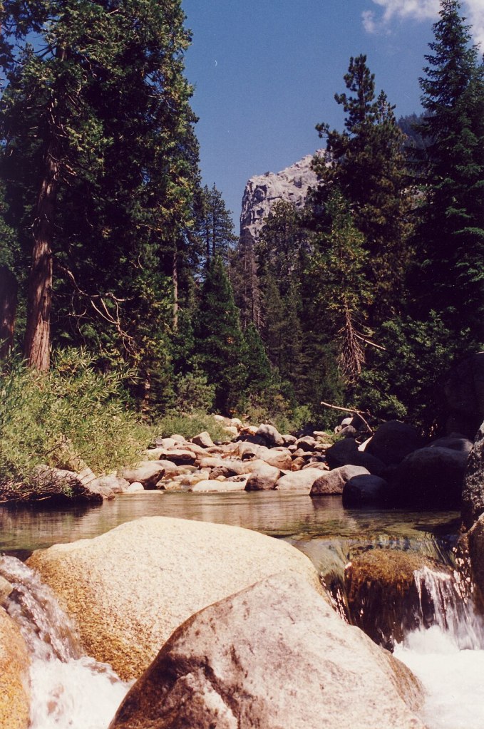
The Western States Endurance Run
If the Western States is legendary among trail runners, it’s because it’s one of the oldest 100-milers, utratrail races ran on a distance of 100 miles1. Before it became a foot race, the Western States was (and still is) a horse race from Olympic Valley in the Sierra Nevada down to Auburn, in the outskirts of Sacramento. The riders have 24 hours to complete the course. This horse race is better known under its nickname: the Tevis Cup.
In 1973, Gordy Ainsleigh was competing in the Tevis Cup when his horse got injured and he had to drop out. He decided that the following year, he would run the (nearly) 100-mile course on foot. And so he did. In 1974, he finished the race in 23 hours and 32 minutes, becoming the first person to run the (nearly) 100-mile course of the Tevis Cup under 24 hours.
In the following years, a couple of weirdos attempted to replicate his prowess. And in 1977, a “Board of Governors” was established to organise the foot race. The Western States Endurance Run was born.2
50 years later, the race is still held every year in late June, between Olympic Valley and Auburn, on a course that is now officially 100.2 miles long.
About temperature
The Western States is a mountain race, part of which takes place on rugged trails. There is significant elevation gain (5500 m) and loss (7000 m). But the race is also famously difficult because of the high temperatures the runners may encounter. In a portion of the course known as “the canyons”, temperatures regularly exceed 40°C. This is too hot for running, let alone running for tens of kilometers. At aid stations, trailers often try to cool off by having their crew pour ice-cold water over them, or by wearing a bandana full of crushed ice. But this only takes you so far, and eventually you have to face the heat.
My question, then, is a simple one: does the maximum temperature experienced during the race influence the percentage of finishers3?
My hypothesis is that it does, and that higher temperatures will be negatively correlated with the percentage of finishers. We are fortunate enough that the official website of the WSER displays a table with the percentage of finishers and the maximum temperature measured in Auburn4 on race day, for each edition of the race since 1974. Time to investigate!
(The first step, of course, was to convert the temperature from °F to °C, because as serious scientists we’re not going to work with freakin’ Fahrenheit. It was already hard enough for me to write about miles instead of perfectly adequate kilometers. As once told in a video on the Real Engineering Youtube Channel: “[the imperial system] is a convoluted mess of measurement units, invented by people who married their cousins.”)
A first glance at the data
For a start, let’s simply look at the percentage of finishers for every year, with a color palette for temperature.
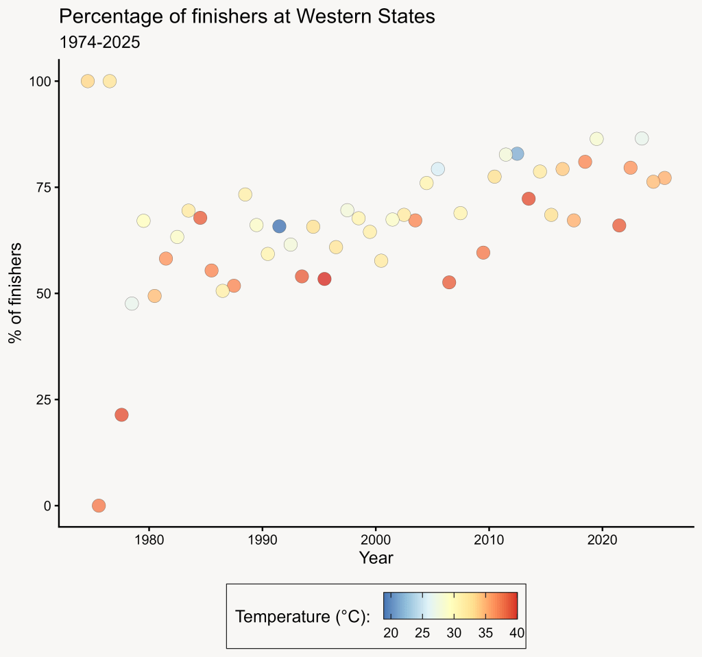
There are a few points with either really high (100 %) or really low (0%) percentages of finishers in the 70s. That’s because in the first 4 editions, there were only 1, 1, 1 and 14 runners! The 5th edition in 1978 had already 63. That’s too few runners compared to the following years, so we’re going to exclude these points from our analysis. We’ll start with the 1979 edition, which had 143 runners. Nowadays, they are nearly 370 on the start line each year.

That’s better! There’s maybe something with temperature, as we see that years with lower temperatures (in blueish shades) are generally in the upper part of the point cloud, and redder points in the lower part. But there’s also a much more obvious trend: the percentage of finishers clearly seems to increase as time goes by!
We can look at it another way, by plotting directly the percentage of finishers depending on temperature:
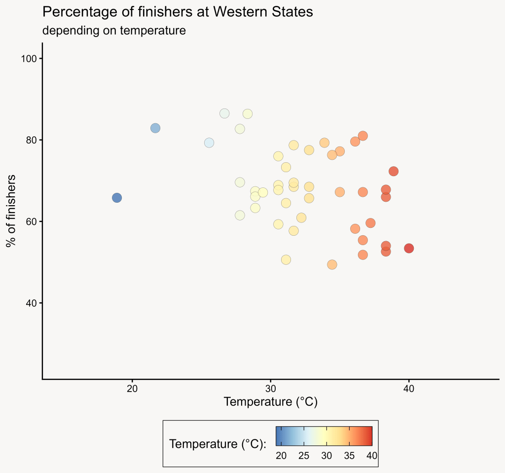
Once again, we can guess there’s something, but the relation is not clear-cut. Instead of colouring the dots by temperature, let’s colour them by year on this graph:
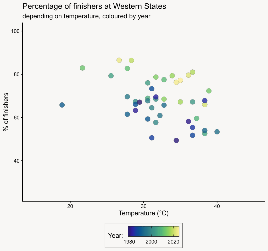
We find again the clear trend that we saw in the first graph! Recent editions tend to have higher percentages of finishers. Probably, the average level of runners is becoming better and better. This is not so surprising: the last decades saw significant improvement in training and nutrition practices of athletes, including amateurs.
But we’re faced with a problem here: how do we evaluate the influence of temperature when there’s this other factor that structures the data? To disentangle the effects of temperature and time, we will use a statistical model.
Generalised Linear Model
I’ll make the assumption that the effects of temperature and time are monotonous; this means that they only go one way. This isn’t necessarily the case: extremely low temperatures could also make the race more difficult. But the lowest minimal temperature recorded in the data is 10°C, far from freezing5. Likewise, we have no reason to believe that runners’ perfomances worsened in some specific period, so the assumption of monotonous effects appears realistic.
Therefore, a Generalised Linear Model (GLM) seems to be the right tool for the job. This is a type of model that evaluates the influence of one or several fixed effects (in our case, temperature and time) on a response variable (in our case, percentage of finishers).
I built the GLM in R, with the invaluable help of the excellent statistics tutorial written by my colleague and friend Bede Davies. I will not detail everything here, but if you’re interested you can check the whole code on my github (https://github.com/vpochic/Western_States_100).
Briefly, I wrote a line of code that specifies the model’s formula and the dataset to apply it to. It looks like this:
# We save the model (computed by the 'gam()' function)# into an object (glm_WSER)glm_WSER <- gam( # Here's the formula of the model Finish_freq ~ Temp_high_C*Year, # We specify where to take the data from data = WSER_data_2, # And this specifies the statistical distribution to use, in our case a Beta # distribution family = betar(link="logit"))
We transformed the percentage of finishers into a frequency6, so our response variable follows a Beta distribution (meaning: it is continuous and bounded between 0 and 1). We tell the function that computes the GLM that we want to model the frequency of finishers (Finish_freq) depending on the maximum temperature (Temp_high_C) and time (Year).
The results!
Once the GLM is built based on the original (true) dataset, it works as a mathematical function that gives a value of frequency of finishers depending on the maximum temperature and the year we provide it; we could write it like this:
Frequency_of_finishers = glm(Temperature,Year)
I built a synthetic dataset with years from 1979 to 2026 and temperatures from 18 to 42°C, and asked the model to calculate a Frequency of finishers for each point in this dataset, with a 95% confidence interval. Here are the results:
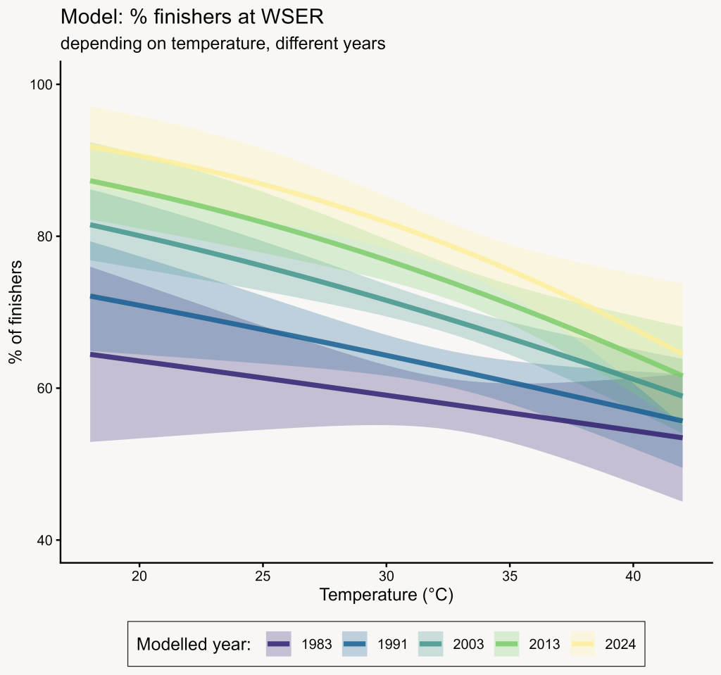
On the graph above, we see that temperature is indeed negatively correlated with the percentage of finishers, regardless of the year. We also see that the negative effect of high temperatures seems to be more pronounced in recent years: the decrease in the percentage of finishers between 20 and 40°C is more important for the year 2024 than for 1983.
But is this model representative of the real data? To evaluate that, we’ll plot the true data on top of the model!
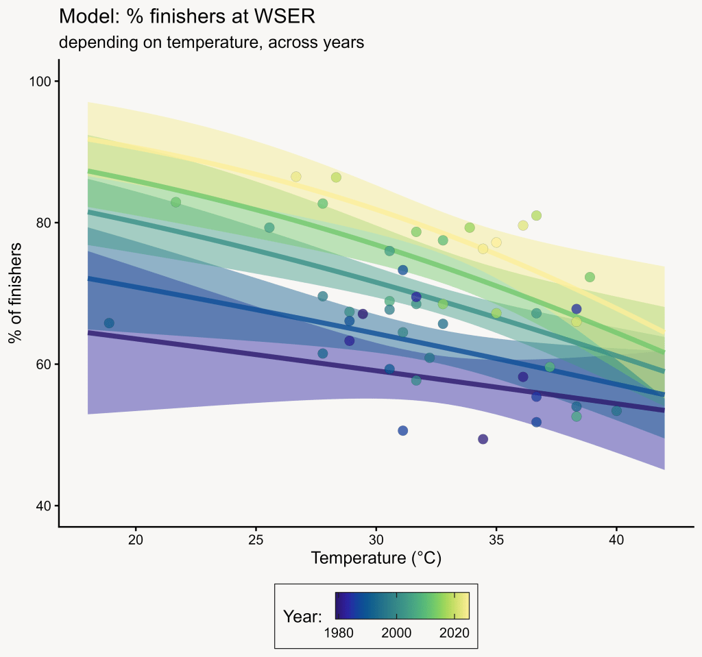
Well, it’s not that bad isn’t it?
We can also plot the model with the percentage of finishers depending on the year, and colour data points and model fits by temperature:
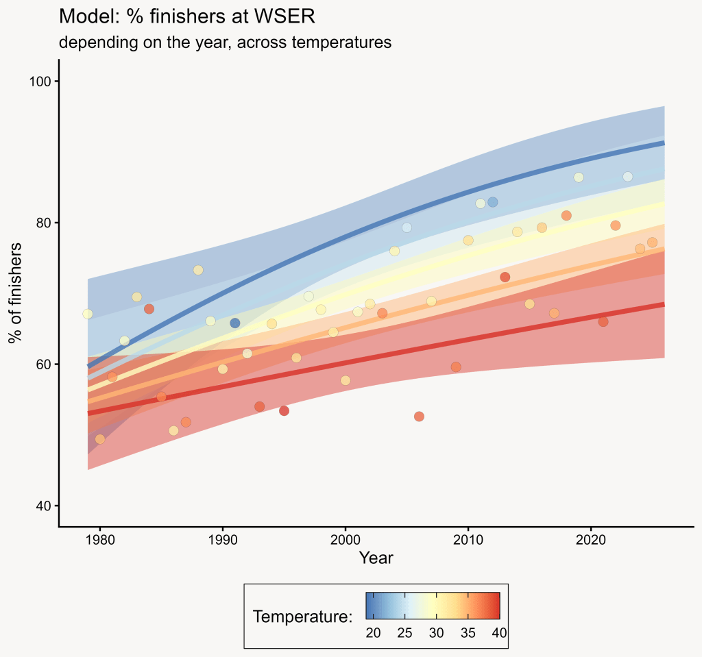
I’m not a huge fan of the looks of this one, because the colour palette makes it a bit difficult to distinguish the model fits for intermediate temperatures. But it does the job!
We see that the percentage of finishers increased with time, whatever the temperature, but that the positive effect of the year is maximal for lower temperatures (i.e. the blue and red curves are further apart in recent years than they were in 1980).
Conclusion, and a prediction
So what did we learn here?
First, my hypothesis seemed to be correct: higher temperatures do have a negative effect on the percentage of finishers. I can see two reasons for this:
- More runners overheat and drop out for medical reasons.
- Extreme heat makes the race more exhausting so more runners can’t cross the finish line under the 30-hour time limit.
Second, there is a steady improvement in the percentage of finishers over the years. As I said before, I think this is mainly due to improvements in training practices and nutrition. It’s also likely that the implementation of strict entry requirements (candidates must have completed at least one 100-mile ultratrail in the previous year to be eligible for the lottery) has raised the average level of entrants in recent decades.
Third, there is an interaction between these 2 factors. The positive effect of time on the percentage of finishers is maximal for lower temperatures, and much less pronounced for higher temperatures. I came up with 2 hypotheses to explain this:
- This could mean that the overall improvement in training and nutrition that we hypothesised didn’t really raise the average runner’s resistance to extremely high temperatures.
- Alternatively, it’s possible that as the entrants became more and more international over the years, more and more runners who enter the race are less used to the region’s scorching hot temperatures, and it shows when they have to face extreme heat.
It’s probably possible to test some of these hypotheses by analysing some data from the WSER yearly entrants list and/or the medical crew’s records. But I’ll leave that to other people!
And of course, there are many other factors that may influence the percentage of finishers (humidity, air quality, amount of snow in the mountainous section of the course…)
Finally, I will stick my neck out a bit and make a prediction based on my statistical model. I checked the temperature forecast for Auburn, CA for Saturday June 27th on my phone’s weather app: the maximum is 22°C7.
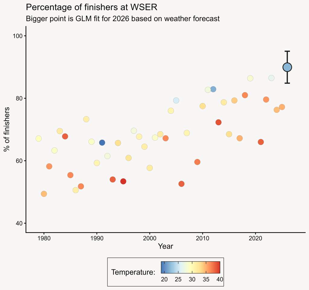
For such a temperature in 2026, the model gives a percentage of finishers of 89.9%, with a 95% confidence interval between 84.8 and 95.1%. It would be an exceptionally good year, one of the best in the race’s history!
We’ll see how this prediction goes: I will update this post with the actual percentage of finishers in 2026, to document how close (or how far) I was.
That being said, good luck to all the runners and volunteers of this year’s edition of the Western States, have fun on the trails and at the aid stations!
No mention of dinoflagellates, plankton or microbes: quite unusual for this blog! But this off-topic post was a lot of fun to make, and on a subject I’m passionate about. And this kind of data analysis is quite fitting for a science blog 🙂
All the data presented in this post come from the WSER official website, in the section “Weather History” (https://www.wser.org/weather-history/). Thanks to the WSER people for making it public!
If you want to have a look at the R code I wrote for the data analysis and plots, you can go to this repository on my github: https://github.com/vpochic/Western_States_100
If you’re interested in applying GLMs or other statistical models with R, you should check out Bede Davies’ very nice tutorials (available for free on his website https://bedeffinianrowedavies.com/)
This post and all the media it contains are under a CC BY license. You can quote and reuse parts of it as long as you cite the author(s) appropriately.
- 100 miles = 160 km ↩︎
- The story of the Western States is often quite romanticized, as detailed in this very interesting and well-documented article (https://ultrarunninghistory.com/gordy-ainsleigh-run/). Ainsleigh was by no means the first person to run a documented 100-mile race, and he was not even the first to run the Western States course! Despite the embellishments, there’s no doubt his 1974 run is an incredible achievement, and that the Western States is a historic monument in ultrarunning. ↩︎
- To be considered finishers, runners need to cross the finish line under 30 hours. ↩︎
- Ideally, we would like to have the maximum temperature in the canyons, or the average temperature over the whole course, but we can reasonably expect that both of these variables will be closely correlated with the maximum temperature in Auburn. ↩︎
- Once again, this is the temperature in Auburn, so there might have been years when the temperature up in the mountains was much much lower. ↩︎
- For this, we just divide the percentage by 100. When we will look at the results, we will just multiply the values by 100 to turn them back into percentages. ↩︎
- I last checked the weather forecast on 2026/06/26, 09:30 p.m. Paris time. ↩︎

Leave a comment